Hi Christoph!

On 10-03-2011 20:44, Christoph Noack wrote:
Hi Paulo, hi Bernhard, all!
[...]
One thing that might be helpful is to have a look at the icon theme and
the source data itself. Should be available here:
http://tango.freedesktop.org/releases/tango-icon-theme-0.8.90.tar.gz
Thank you very much for this link! I did a quick search for the tango
source, but had no sucess.
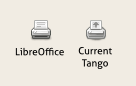
But when I had a look at these Tango icons, I saw they are sight
different from "our" Tango icons.
A sample:
http://1.bp.blogspot.com/-C6wDLfl-snk/TXmTyPNRFpI/AAAAAAAAAdQ/p4gDJyYmh5M/s1600/differences-tango-icons.png
The shadow is different on each one, then right now I'm making two
correct "shadow version".
I'm a bit tired at the moment (not because of you, but because it is
already very late here ...), so it might be wrong what I state.

As far as I understand, the bigger icons in LibreOffice are 26px large.
Since LibreOffice can be used on different platform, we don't always
conform to the standards on the target platforms ... thus, when using
LibreOffice together with the Tango icons, I think they added 2px to
fill the remaining space.

Galaxy states 26px icons "large size":
http://ui.openoffice.org/VisualDesign/OOo_galaxy.html

Gnome states 24px icons for the toolbars:
http://library.gnome.org/devel/hig-book/stable/icons-types.html.en
Thank you for make it clear. ;-)
Oh, the developers just changed it to the Tango icon set - but (as far
as I know) the Galaxy set is still shipped and therefore might also need
some icons. However, we might not need to be perfect in any case ;-)

And concerning your great icon comparison [1] - some personal comments:
Proposals 1 and 3 are close to perfect! The only minor proposal is to
make the shadows a bit more subtle ... I cannot really say why, it is
just the first impression every time I look at those.
You did a good point! After I saw the source file of Tango icons, I
finally achieved the "right" shadow.
Here it's another comparison between the old and new Tango icons (from
your linked source file and LibreOffice's version) and the Galaxy icons.
http://1.bp.blogspot.com/-htnB3ln0AyY/TXmvHpBHEZI/AAAAAAAAAdc/Y4INmuU74KE/s1600/Toolbar-Mimetype-Icons-comparison-2.png
The final SVG file with these 3 versions together:
http://wiki.documentfoundation.org/File:Toolbar-Mimetype-Icons.svg
(force reload)
Well done, Paulo! Thanks for your work ... seems that we need to ship
them soon ;-)
Thank you Christoph! :-D
Although your recent blog posting asked for some more feedback, I think
it's better to get some sleep ... and come back with a fresh mind.
Blogging (or just writing) is the best way to organize my ideas and
avoid to forget issues, like I did with the status bar icons...
Good night,
~Paulo
--
Paulo José O. Amaro
Computer Science Student
Federal University of São João del-Rei
WebDesigner / Linked Empresa Júnior
Blogger / casatwain.com

--
Unsubscribe instructions: E-mail to design+help@libreoffice.org
List archive: http://listarchives.libreoffice.org/www/design/
*** All posts to this list are publicly archived for eternity ***
Context
Re: [libreoffice-design] LibreOffice Icons · Tobias Bernard
Re: [libreoffice-design] LibreOffice Icons · Christoph Noack
Privacy Policy |
Impressum (Legal Info) |
Copyright information: Unless otherwise specified, all text and images
on this website are licensed under the
Creative Commons Attribution-Share Alike 3.0 License.
This does not include the source code of LibreOffice, which is
licensed under the Mozilla Public License (
MPLv2).
"LibreOffice" and "The Document Foundation" are
registered trademarks of their corresponding registered owners or are
in actual use as trademarks in one or more countries. Their respective
logos and icons are also subject to international copyright laws. Use
thereof is explained in our
trademark policy.