Hi Michael,

cool, looks like a _very_ promising start :-)

Am Dienstag, den 14.06.2011, 11:04 +0100 schrieb Michael Meeks:
Hi guys,
I have to task switch for a week or so now, so I just dumped my latest
(hackish) re-hash of the style preview / selection pane I was working on
here (click the navigator paint-can):
http://people.gnome.org/~michael/data/2011-06-14-style-preview.diff
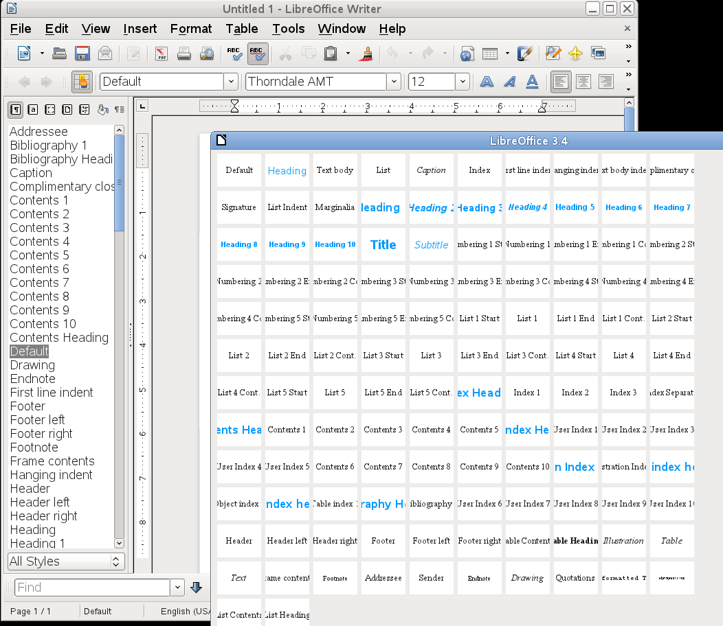
It looks like this:
http://people.gnome.org/~michael/images/2011-06-14-style-preview.png
Okay, so at the moment it is "just" a matrix like preview in a separate
window. Each of the previews seems to render the name of the style in
100% size, centered. Correct?
      I had a few questions:

      a) ux guys - would you like a side-bar a bit like this ?
         could we make that a 'mode' of the style navigator ?
              + what interaction modes would work well here:
                mouse-over style preview ?
Some QuickThoughts (tm):
      * Toolbar Drop-Down for Paragraph Styles (m x n matrix instead of
        a plain list)
      * Paragraph Styles in the Stylist (preview for each list entry,
        for all modes but hierarchical view)
      * Character Styles in the Stylist (preview for each list entry,
        for all modes but hierarchical view)

Of course, the devil is in the details - we want to keep this list
manageable (size, number of items), the styles (easily) editable, the
stuff accessible (keyboard nav etc.).

So, these thoughts are a start, I think.
+ context specific style/palette adaption ?
Mmh, what do you have in mind - we already have some (more or less
working) context specific context adaptations in the Stylist.
b) any more thoughts on that ?
      c) since this is essentially a stolen (re-factored) 'preview'
         widget from the existing 'style' dialog - I wondered ...
         are there other easy-to-steal preview widgets that we can
         re-use to make applying these things easier ?
         [ perhaps border selectors ? ].
Mmh, don't know whether this fits technically (we'll need that anyway,
soon *g*), but how about the new toolbar drop-down selectors in Impress.
See: http://www.youtube.com/watch?v=WnfZlYU0SNc (interesting part starts
exactly at minute one).

Furthermore, the slide sorter preview, or the master slide preview might
be other candidates.
      d) Do we have an enterprising hacker wanting to play with
         creating a more attractive navigator / style pane here?
              + it is slightly complicated due to the shared
                nature of sfx's style code between all components

      Thoughts ?
Hackers? :-)

Cheers,
Christoph
Context
Privacy Policy |
Impressum (Legal Info) |
Copyright information: Unless otherwise specified, all text and images
on this website are licensed under the
Creative Commons Attribution-Share Alike 3.0 License.
This does not include the source code of LibreOffice, which is
licensed under the Mozilla Public License (
MPLv2).
"LibreOffice" and "The Document Foundation" are
registered trademarks of their corresponding registered owners or are
in actual use as trademarks in one or more countries. Their respective
logos and icons are also subject to international copyright laws. Use
thereof is explained in our
trademark policy.