Re: [Libreoffice-ux-advise] [GSOC] iOS remote control design
- Siqi Liu <me -AT- siqi.fr>
- Mon, 19 Aug 2013 01:51:07 +0800
Hi Mirek,

Sorry for the late response. I was trying to stay focused on the Bonjour
support for Windows and now I can move on to more UI/UX improvements.

2013/8/13 Mirek M. <mazelm@gmail.com>
Hi Siqi,

On Sun, Aug 11, 2013 at 4:06 AM, Siqi Liu <me@siqi.fr> wrote:
Hello Mirek, What's your take on the new screens? Eager to hear from you on them.You can find them here: http://siqi43.wordpress.com/2013/08/10/a-slightly-flattened-version-of-ios-impress-remoteI'll just go through them: The Connection screens: * What is the purpose of having a screen with a single button on it on the tablet? Could you please just show the computers to connect to right away, as I assume you do on the phone?
Yes, I basically used this screen to provide a background for the pop up
modal views. I can fire up the modal views right away and keep the orange
background only (without icon, connect button and app title, or any
suggestion on what kind of background to use? ). But in that case, there
won't be a "cancel" button on the server list page because we must keep the
modal view open if we don't have a button to reopen the server list page.
We are therefore forcing users to open this modal view in a sense... That's
my only concern here but I can definitely do this if it doesn't bother you.
 * If you decide not to, please at least make it look like the Connect
button is tappable, and it would probably be good to use the whole Impress
remote icon graphic rather than a cut-out square (it makes sense in an
icon, but looks odd when there's ample room for it not to be cropped).
I think I will remove this page then, by keeping the orange background
only.
 * The text on the PIN screen should read just like how you would say it
in real life. Try "In Impress, go to "Slide Show -> Impress Remote" and
enter the PIN [1678]." The string "Waiting for validation from Impress..."
isn't necessary unless it takes a long time to validate.
Well, this depends on how fast users enter the PIN code on their PCs
actually... I will remove it if it seems to be unnecessary. By "Waiting" I
actually mean that the app is waiting for pin pairing from users.
 * It'd be better to not have the presentation preview page and just
start the presentation right away. The page is just an unnecessary extra
step.
Euh...but what happens when the iOS device first paired with the PC? It
starts the presentation right away without asking if the user want to start
it? And where should I put those configurations or they are unnecessary as
well? I was keeping it because 1) the Android app has it as well 2) This
gives users a chance to do some configuration and only start the
presentation when they are ready. I don't think one extra step which helps
to make sure the right presentation is running and all the config are right
in place would bother the lecturer... if you are in front of several
hundreds of people you don't want to make any mistakes ... that one extra
assurance weighs heavier than one extra tap on the screen as far as I am
concerned....

Anyway my opinion might be subjective, but I really can't remove it before
changing the protocol, which needs some kind of consensus with the android
app as well.
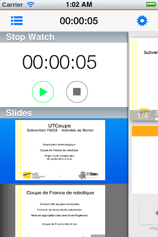
The presentation screens:
* Where is the pointer button on the tablet?
There isn't one. If you touch the preview image (and the preview/next
button on the side will become transparent), you get the pointer. Since
it's large enough for users to use their pointer, it's unnecessary to add a
button for that effect. (on iPhone the Pointer button was used to show an
enlarged preview image)
 * The Options button looks way out of place on the tablet. Please at
least keep its background white or light gray.
I am such a bad designer :-P, I was trying to reproduce the black side list
like the one from this post on
theverge<http://www.theverge.com/2013/8/15/4623016/buying-a-laptop-everything-you-need-to-know>.
It was shown on the left when you scroll down to the main article. Whenever
you click on the gear, it will slide to the left a little bit and show the
popover. When the popover is dismissed, the gear will slide back to the
right. But yeah, now looking back, the coloring doesn't seem right. I will
change that.
* The Pause and Clear buttons are really hard to see. Since the app
doesn't use TextKit, therefore not being able to tap into iOS 7's font
accessibility options (I assume), it'd be good not to use Helvetica Neue
Ultra Light at all. The Pause button should also have a different color.
That was already Helvetica Neue (without Ultra) Light I think. And I'm kind
of into a dilemma now... here is a screen from iOS7 of Apple's new clock
app (I did my circle button design before noticing this :-P). Apple
apparently resizes the text in order to put all text into the circle when
translated to other languages.

[image: Images intégrées 1]

I've also tried to replace the text with icon, which gives us this:

[image: Images intégrées 2]

Which way should I go then? Rounded-rect button with text? circle button
with text? Or Circle button with symbols?

 * The "More" label in the More menu is unnecessary and looks like a
command at first sight.
Agree with you. Removed.
* I don't particularly like the idea of having the slide picker onscreen
all the time, but that's a subjective feeling.
On iPad it seems to make good use of the available space. Also I couldn't
come up something to put in place of the slide picker...and it would be too
large if I enlarge the slide preview image even more.
* The slide picker should have the same aesthetic as the rest of the app.
Noted, I will do some tweaks on that.
* The slide preview itself looks stretched out and blurry -- I assume
that's a bug that will be fixed, right?
I would say it has become a bug now :-P
In older implementation for the remote control was only designed for
phones. So the images sent from computers are only big enough for phones
which helps to reduce the traffic over the network when sending them to the
phone. Now with iPad....well that's no longer "big enough".

I've proposed to change this by adding a param during the hand-shake period
(by specifying a "small", "medium" or "big" screen size parameter for
example). But I would need Artur's confirmation in more details on how to
implement this. I've cc Artur as well.
In general, I'm not too keen on the iOS7-esque look. It feels kind of like
iOS 7, but not quite there (the fonts sometimes have different weights, the
icons are thicker and have a different style, the slide sidebar keeps its
iOS 6 look, ...), and it might feel sloppy when juxtaposed with
built-for-iOS7 apps.
If we want the app to stay consistent on iOS5/6/7, then we would be obliged
to do some really deep customization... in iOS7 the app will have iOS7
styled slide sidebar so it shouldn't look too strange when compared to
other iOS7 app. But...on iOS6 I must say that it's kind of weird to have a
iOS6 tableview side-to-side to an iOS7 style navigation bar...

For now I think I will check all the fonts to use Neue Light instead of
Ultra Light and try to do some customization for the tableview. I would
love to have a more complete UI customization implemented but that would
require not only too much work but also too much design genius from me as
you can tell now :P
 That said, I'm not really sure what the best solution here would be.
IMHO, it might be best to have our own consistent style on iOS like Google
does, but I understand that's a big undertaking and it's not something I'd
like to work on. I'm hesitant about fully embracing the iOS7 look, given
the accessibility implications. I guess we could embrace that look where
possible, but use Helvetica Neue Light instead of Ultra Light.

Do you want me to tint all buttons/icons in orange to stay in line with
the Android app? I've taken blue only because it's one of the default on iOS7.Yes, please tint them.Also, Fitoschido <http://fitoschido.wordpress.com/> has made a good point in his comment I think. What's your opinion on that?I agree that the iOS7 design is unfortunate in this case, but I feel like using icons instead would be sacrificing clarity, at least in the case of the button "Clear" (oh, the irony). I'd recommend to use a thicker font weight, more visible colors (how about orange for both), and delineate the button with a round rectangle instead of a circle (you never know how long translations will be and if they'll fit). Or you could just not have any delineation for the buttons whatsoever -- I guess that'd be the better choice for iOS 7.
Please take a look at the screens above. Give me your final conclusion and
I will do that ^^

Thank you,

Siqi
 Cheers,
Siqi


2013/8/8 Siqi Liu <me@siqi.fr>
Hi Mirek, On Aug 7, 2013 7:55 PM, "Mirek M." <mazelm@gmail.com> wrote:Hi Siqi, On Mon, Aug 5, 2013 at 2:28 PM, Siqi Liu <me@siqi.fr> wrote:Hi Mirek, Thanks for you feedbacks! I've responded inline for certain issuesthat you have pointed out.On Aug 5, 2013 11:45 AM, "Mirek M." <mazelm@gmail.com> wrote:Hi again, I was hoping someone else would comment, because I'm notwell-versed in the iOS HIG and I don't care much for the platform. It doesn't help that the iOS 7 HIG is hidden behind an Apple ID login, which I don't have -- if you have one, take a look at the HIG [1] and the iOS 7 UI transition guide [2].Me neither, I'm fairly new to iOS dev actually ^^ I will take a lookat it.OK, good.Based on what I've gathered from articles, screens, and videosabout iOS, though, here are my comments and concerns:* The swipe-in sidebar might not work on iOS 7 devices, as theswipe from the left side of the screen is used to go back. I'd recommend installing an iOS 7 beta to test out your app, and instead of a swipe-in sidebar, how about a pinch-out overview like on the Android app? As a plus, it won't be possible to accidentally show the sidebar when you meant to go to the last slide.Actually the swipe in sidebar is activated only by the detail buttonon the upper right corner since I don't want users to accidentally activate it by a swipe gesture. However I do need to swap the position of "stop presentation" button (on the left) and the "detail button" (on the right), didn't know why I placed them in wrong positions :-POK.* The style seems to be an odd combination of iOS 6 and iOS 7styles. Please pick one and go with it (I would say iOS 7 is a better choice). It would be good to use orange as the accent color, like we do on Android.Ok, I will change the accent to orange throughout the app, which wasgreen before.In terms of styling, I personally don't have any iOS 7 compatibledevice to test on so I can either test it in the iOS7 simulator (which is still in Dev preview) or really just customize all the iOS 6 elements to make them feel like iOS7...which doesn't appear to be a good choice to me...iOS 7 simulator sounds good. Don't customize the iOS 6 elements --that would probably not give accurate results. Actually if we release the app as an iOS6 app, (which would be the case) it would continue to use iOS 6 ui elements on iOS7 devices. For now I've just customized some elements to be similar to the one used in ios 7, and it turns out fine since basically we are removing old styles components (gradients, shadow etc to get flatter). I have tested on iOS6 and iOS5 devices and both work fine. I've also borrowed an iOS7 device to test on and it works as expected though some tweaks are necessary to make the feeling more coherent throughout the app.But yes, I will investigate into how to make the design styletransition between iOS6 based app and iOS7 based app. For now, all the customized elements are designed to be similar to the iOS7 because, ...let's admit it, the iOS6 UI is just too boring...I'm kind of struggling here as well.* I don't quite understand the layout slide show control pad. Whyis the next slide shown on the left whan one gets to it by swiping to the right? Why is it shown at all?First, I did not stick to the Android app which used a coverflow tochange between slides because it's to me a little bit trickier to change to next slide by swiping. It doesn't seem to be as reliable as to simply click on a button. With a button, users don't even need to look at the app to know if they have swiped to the next slide or the next next slide... It was pointed out by Michael M during the initial proposition period as well and that's also why I made two big buttons for users to reliably control the next/previous slide.This would be good to test out. On the one hand, tapping is simpler,on the other, it requires the presenter to look at the screen to hit the target area, whereas, with swiping, the whole screen is the actionable area. Hmm..this still doesn't convince me... Scrolling is designed to easily browse through multiples items (in a nonlinear way like pick a music album) , and here the most used functionality is next/previous slide for a normal presentation. It doesn't feel right to put a cover-flow in such a prominent place...if users need to switch to another slide, it isn't really complicated to use the sidebar to do that. However if you do think it's a better way to go I can try that, no problem here.BTW, on Android, there's also the option to use volume buttons toswitch slides. Good point, I'll check if this is doable on iOS since they are known to be more strict on APIs. :-PSecond, the reason I show a secondary slideshow preview is twofold:1. It can be helpful for users to know what's the next slide, especially when the presentation is at the last slide, in which case the next slide will be black with a big "SlideShow Finished" on it 2. The screen size of iPhone is much narrower and shorter than most of the android devices, which makes it impossible to present only one slide while leaving enough space for the lecturer's notes and the buttons on the bottom (if we maintain the aspect ratio of the slideshow of course). If we want to keep aspect ratio of the slideshow image, it presenting two slides at the same time seems to solve the problem.However, it does make more sense to place the next slide to theright. I will change that soon.Thanks. That will make more sense. Be sure to keep the new iPhone shape in mind as well, though.* What does the Touch Pointer in settings do and how is itdifferent from the Pointer button in slide view?The "Touch Pointer" option, when disabled, activates accelerometerbased pointer. But if at the end of gsoc I don't have a reliable accelerometer based pointer, I will remove this option and makes it touch pointer only,The pointer button, in "touch pointer" mode, will display an enlargedcurrent slide, which allows users to touch the desired part more accurately.In "accelerometer based pointer" (which is highly experimental),users can keep holding on this Pointer button and a pointer will be shown on the phone, which can be moved based on accelerometer. When users release this button, the enlarged picture and the pointer will be dismissed.OK. It'd be good to test the usability of this feature when it works.* I think it's important to show the clock in the presentationcontrol pad, as that's the screen the presenter will be on the most.I agree with you, I think it would be possible to place it at thecenter of the navigation bar.Sounds good. Could be similar to the current Android implementation.* On the "New Server" page, "Server Name" should just read "Name"and it should be below the "IP address" entry, as it's optional. The label below is unnecessary.Ok, will do so.Thanks.* The Slide sidebar seems undiscoverable. Please have a button forit, preferably in the main toolbar.Yes, it is on the main toolbar (the navbar on the top), I willexchange the position of the "stop presentation" and this detail button.Good.* I don't think "Stop Presentation" should get such prominentplacement. (After all, it's only used once, and you really don't want to tap it by accident.) I'd suggest replacing it with a "Back" button, but only if the presentation can be restored right away if the button is accidentally tapped. If not, I'd suggest putting it in the menu.Ah, I see, it's actually not a menu button...it's the button toreveal the sidebar. Actually I'm thinking of replace that button with a "gear button", which reveals a menu where users can "stop presentation", this prevents some accidental clicks as it requires two steps to click on the stop button.Sounds good.Stop presentation, restart presentation, blank screen are now in a popover.* I don't think the slide show preview page is necessary.This page presents in the Android app as well and it's actuallynecessary in terms of connection management: select a server --- connection --- pairing --- "After paired with PCs, users will need somewhere to call start presentation". When users click on "stop presentation", they will be brought back to this preview page, where they can restart presentation if they will.Is that really necessary? Can't the device screen just be used?Ideally, the app would save state and stay connected after ending a presentation, so that you it would restore state immediately after you chose the same computer.That would also get rid of problems with the "Stop Presentation"button -- restore would be instantaneous, so tapping it by accident wouldn't matter much. Ah, I see your point. Actually If the presentation is running and users come back to this preview page, the transition is immediate. So they resume to the previous state. However, the stop presentation should really stop the presentation both on the phone and the pc right? And in that case, if we don't have this page, users will be directed to server list page. Even users click on the save device, the presentation is not running (stopped by phone), and where should they be directed then? For now, if the presentation is running, we restore the presentation page immediately, if not, it stays at the preview page, waiting users to call "start presentation".In Android IIRC this page has only a "start presentation" button. IniOS I've just implemented it so that it presents the title of the document currently displayed on the PCs as well. Also, this leave us some space to do some presentation specific configuration like auto-start timer & touch pointer (when disabled, we activate accelerometer based pointer).BTW, what's in that menu? It'd be good to know.The SideBar .... Bazinga! But yes, should be on the left actually.Will correct that ^^Good.[1] https://developer.apple.com/library/etc/redirect/WWDR/iOSHIG [2]https://developer.apple.com/library/etc/redirect/WWDR/iOSUITransitionGuideHope this clarify certain aspects of the current design! And I willpost some modified screens on the Wiki later.Thanks, looking forward to it.Thank you! SiqiThanks again for your advice! The app has already changed a lot since your last email ^^ will post some screens shortly. Siqi-- -------- Cordialement, Siqi LIU Étudiant Ingérieur, Université de Technologie de Compiègne Vice-Président de l'association robotique UTCoupe Responsable d'atelier de ClubChine ------ Tel. +33 7 61 16 95 83 email: me@siqi.fr ------
--
--------

Cordialement,
Siqi LIU

Étudiant Ingérieur, Université de Technologie de Compiègne
Vice-Président de l'association robotique UTCoupe
Responsable d'atelier de ClubChine

------
  Tel. +33 7 61 16 95 83
  email: me@siqi.fr
------
Context
- Re: [Libreoffice-ux-advise] [GSOC] iOS remote control design · Mirek M.
- (message not available)
- (message not available)
- Re: [Libreoffice-ux-advise] [GSOC] iOS remote control design · Mirek M.
- Re: [Libreoffice-ux-advise] [GSOC] iOS remote control design · Mirek M.
- Re: [Libreoffice-ux-advise] [GSOC] iOS remote control design · Siqi Liu
- Re: [Libreoffice-ux-advise] [GSOC] iOS remote control design · Siqi Liu
- Re: [Libreoffice-ux-advise] [GSOC] iOS remote control design · Mirek M.
- Re: [Libreoffice-ux-advise] [GSOC] iOS remote control design · Siqi Liu
- Re: [Libreoffice-ux-advise] [GSOC] iOS remote control design · Mirek M.
- Re: [Libreoffice-ux-advise] [GSOC] iOS remote control design · Siqi Liu
- Re: [Libreoffice-ux-advise] [GSOC] iOS remote control design · Mirek M.
Privacy Policy |
Impressum (Legal Info) |
Copyright information: Unless otherwise specified, all text and images
on this website are licensed under the
Creative Commons Attribution-Share Alike 3.0 License.
This does not include the source code of LibreOffice, which is
licensed under the Mozilla Public License (MPLv2).
"LibreOffice" and "The Document Foundation" are
registered trademarks of their corresponding registered owners or are
in actual use as trademarks in one or more countries. Their respective
logos and icons are also subject to international copyright laws. Use
thereof is explained in our trademark policy.