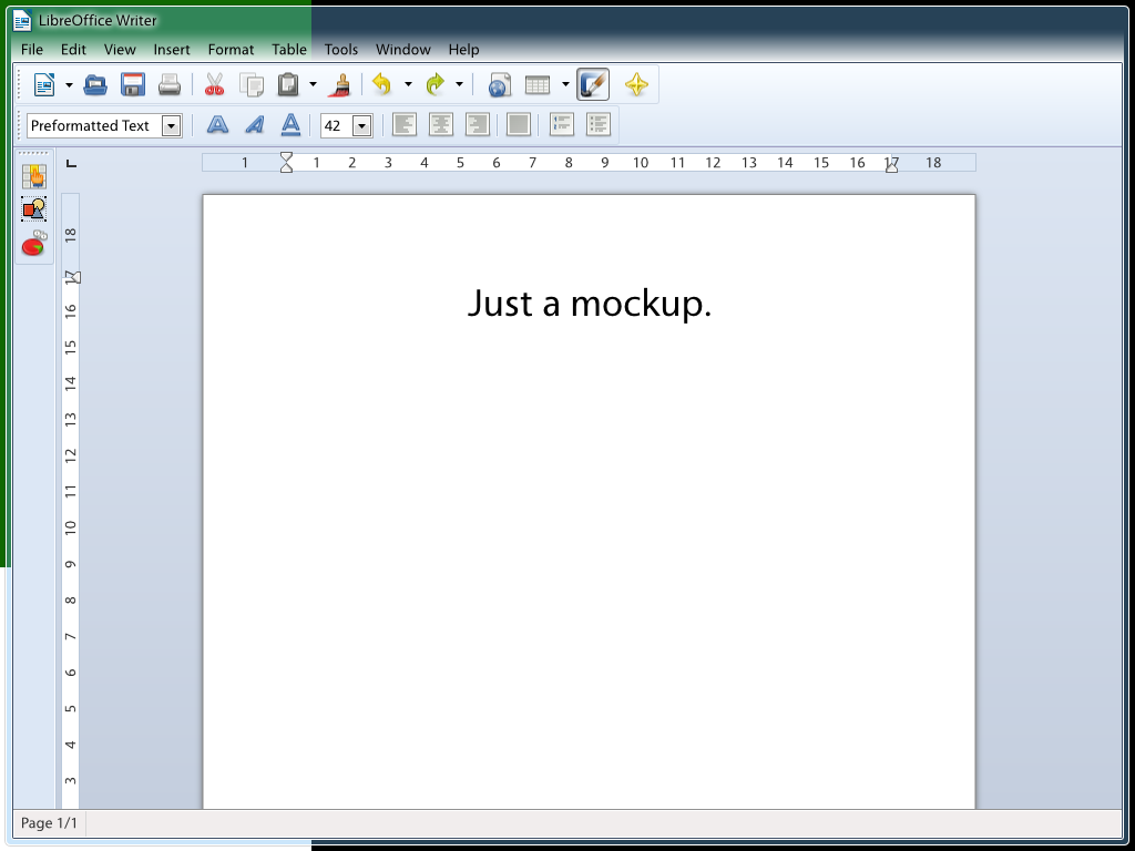
Hello Kendy,

here's another idea for the look of the menu bar in Windows: I think the
easiest way to make it look better right is to just use the same
gradient from left to right – removing the very complicated triangular
gradients to the sides.*
Therefore, can you maybe try with a simple gradient with the following
properties?

width: inner left light border to inner right light border
height: 35px @ Segoe/9pt/96ppi (higher/lower for other menu font sizes)
top: #FFFFFF00
(15% from top: #FFFFFF0F)
(70% from top: #FFFFFF96)
bottom: #FFFFFFC8

[The steps in parentheses aren't strictly necessary, but the first
should avoid the gradient looking too harsh over dark backgrounds, the
second should improve readability a bit.]
I've attached a mockup of the approximate look. Do you think you could
make this work? (Also, sorry for saying that making the menu font black
were simple – I clearly spoke with ignorance there.)

Astron.

* In the future, we could possibly put an SVG image under the menu to
achieve an effect more similar to MSO 2010, but clearly this is not the
time for such a proposal.
Attachment:
gradientmenu.png
Description: PNG image