Hi Michael,
       Ok - I've pushed a fix to master that nails that; we can now have
proper > 1 bit transparency in there: hopefully that'll let us make the
handles look rather prettier as a first pass. Prolly we want to split
them up to make them a uniform size too but ...
Awesome! Thanks.
We could start on a new, reduced sprite now, but that might be not so
helpful immediately (for 3.5).
That would also allow to think about what size our handles should be
(even or odd amount of pixel per side?)
2. there's something really weird: LibO resizes the large, 9px*9px
handles to 8px*8px – also true for the other images: all are displayed
at (n-1)px*(n-1)px
That is very odd; I took a quick look, but can't see that in the code - it would be pretty hideous if we were scaling those guys - and I'd imagine it would make them look -much- worse than your shot if we were - the interpolation would be horribly slow and the result even uglier. Are you sure it's not just the next-size-down rectangle ?
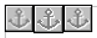
I am. I only replaced one (the 9px*9px) of the handles (as a test). If
LibO had used any other handles, they would have been green not blue.
Also, take a look at the attached image. It shows the stock anchor
image at 400%, left to right: in-program (screenshot), extracted from
sprite (markers.png), the image from the sprite resized with Gimp's
"normal" algorithm.
Then, as probably everyone can see, LibO has far too many differently
coloured handles (six colours, srsly?) – unless someone knows where
the rest of these are ever used. It would be helpful to see which are
in use and which aren't, so the appropriate ones can be skinned.
Heh ;-) I'd like to reduce the number of sizes too - quite why we have so many I don't know; but that'll need more code cleanup. Either way, hopefully this opens the door for making them a lot prettier.
For now, it will be enough to replace the images that are actually
used (red rounds, cyan squares/rounds, green squares, anchor, "glue
point" image, crosshair) and leave the other images unchanged. This
will look ugly in the sprite, but no one will ever look at that.

Regards,
Astron.
Attachment:
anchor-resized.png
Description: PNG image