18.03.2014 09:39, Stefan Knorr kirjutas:
Hi Matthias,

thanks for the overview, much appreciated!
Hi Stefan, thank you!
Microsoft Word uses an A with paintbrush or two A-s for Change styles:
http://www.ablebits.com/_img-blog/excel-styles/excel-ribbon-styles.png
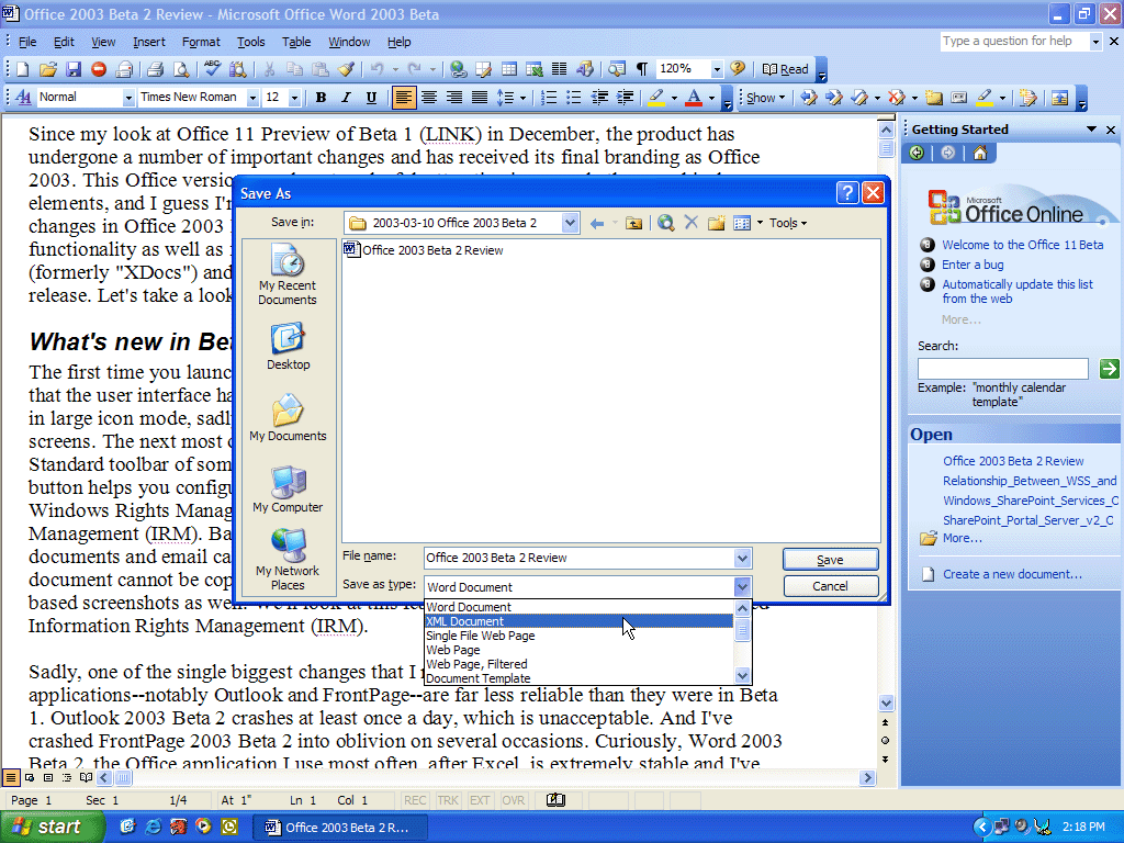
Seems to be one of the better ones, actually. It's a bit text-centric,
but not as much as previous iterations were:

https://lh3.ggpht.com/_Ck5gHAkZqC0/TGTbYWBuz_I/AAAAAAAAAA0/jj9vPoIomVM/s1600/office2003_beta2_03.gif

(Word 2003 screenshot, the Styles icon is in the second toolbar from the
top, first from the left [AA].)
Here you have two similar ones side by side, one for styles dialog, the
other for quick styles (looks like it is visible only when window is
extremely narrow):
http://d1dlalugb0z2hd.cloudfront.net/vpuml/tutorials/word_screenshots/03_to_modify_style.png
For Word being text centric is all good, because it is used for text
styles only. Word does have numbering styles, these are located
elsewhere and that's about it. It doesn't need more generic icon.
Zoho uses a combination of both two A-s and a paintbrush:
https://www.zoho.com/docs/images/saved-styles.png
Similar to Word's icon, but I am not sure if the second A improves on
the design.
The second A on Word icon clearly shows it has different font and color.
Zoho icon does not.
If Word's icon didn't have two A characters, then paintbrush with either
single or double A could mean text color as well (so Zoho icon kind of
relies on Word icon).
Adobe uses styled S (doesn't translate that well)
http://www.upload.ee/image/3948304/adobe-styles.png
That was Apple's I-Work, I think. My opinion of it is that this icon is
about as bad as it gets. (Not internationalised [the S very
English-specific] and looks like the paste from clipboard icon.)
On the other hand using S at least makes sense for the English speaking
world and for languages which have adapted the word from the same source
(e.g Estonian has "stiilid"), this part of population is rather large,
using just A is equally bad for everyone (unless there is a
language...). Conclusion, I wouldn't say using S is that bad.
or a combination of "color icon" and A for character styles and pilgrim
¶ for paragraph styles in InDesign:
http://www.upload.ee/image/3948317/indesign-styles.png
Well, the styles part of the icon seem to be the two little squares at
the bottom left. I am not sure what they are supposed to tell me. Maybe
something like copying of attributes from a master [square with thick
frame] to an instance of the element [overlaid square with thin frame])?
These two squares stand here for "color" (see the color selection
indicator for background and foreground colors in GIMP, Photoshop or
"fill and stroke" color in vector programs such as Inkscape, InDesign,
Illustrator etc). Basically the equivalent for paintbrush or palette.
However, I don't think they would work standing alone -- which we'd need
since our UI is different from Adobe's
True, we need both an icon for "all kinds of styles" and for every
specific style.
Right now we have this set if icons, all are similar, paper or notebook
indicates they are styles:
http://www.upload.ee/image/3953205/styles_icons.png
One interesting icon an A made of a ruler, a pencil and a paintbrush
(metaphor similar to Sifr icons):
http://www.upload.ee/image/3948361/an-icon.png
Unfortunately, that is Apple's App Store/Application Folder icon. So,
can't use that.
Can't they pick another one? Seriously. (nah, just kidding)
Even if they have trademarked the icon, then there certainly are ways to
combining an A from paintbrush, ruler and a pencil (or a pen) so that it
infringes nothing. Question rather is if the metaphor is good and
understood. But it certainly isn't the generic "styles" icon.
I would propose using stencil ruler as the metaphor. Stencil is used to
draw similar objects (this is what styles are about). A Sifr-style icon
could look something like this:
http://www.upload.ee/image/3948188/stencil.png
In Tango, we now already have a stencil to toggle the Draw toolbar. It
looks pretty similar, except that there are four instead of three shapes
in it.
In LO 4.2.2 drawing toolbar toggle pictures a pen or pencil with a line
being drawn (everything except Sifr) or a cup with drawing tools (Sifr).
A picture, please?
My conclusion is that it might be good to either use an icon more
similar to MSO's [recognisably so] or stick to what we have in Tango.
I am not opposed if nothing better is found.
The very best solution would be a metaphor which would be same for
paragraph, character, page etc styles as an addition to the specific
icon and would work just as well as standalone icon. Right now it looks
like this metaphor does not exist (yet?). IMHO stencil is not bad as a
standalone icon but does not work as an addition to the other icons.
Tango icon could be interpreted also as picking a color from a color
card or palette. An artist's palette could work as a standalone or as a
small indicator. But it certainly would be confused to be a color
picker. Other similar metaphors which unfortunately are hard to picture
are catalog, perforated card (aged metaphor or will be obsolete soon),
set of folders (already used). A coin stamping machine? A row of
identical shapes of rectangles, another of circles.
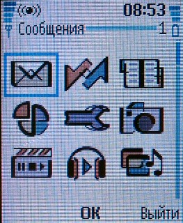
And interesting icon for "Profiles" (very similar concept to styles) in
my old Nokia is a pizza divided into four, one piece is a little apart
and it has a wrench (for settings, not properties). The pizza, pie or
whatever it is, probably stands for "one of many". A little later Nokia
renamed profiles to styles, but I unfortunately don't have a phone from
that era.
Left middle, without wrench and coloured:
http://www.ixbt.com/mobile/images/nokia/7600/nokia-7600-screen-mainmenu.jpg
Looks like Symbian uses similar divided pie concept but with a note to
make it clear: https://betalabs.nokia.com/sites/default/files/What.png
Regards
Mattias

--
To unsubscribe e-mail to: design+unsubscribe@global.libreoffice.org
Problems? http://www.libreoffice.org/get-help/mailing-lists/how-to-unsubscribe/
Posting guidelines + more: http://wiki.documentfoundation.org/Netiquette
List archive: http://listarchives.libreoffice.org/global/design/
All messages sent to this list will be publicly archived and cannot be deleted
Context
Privacy Policy |
Impressum (Legal Info) |
Copyright information: Unless otherwise specified, all text and images
on this website are licensed under the
Creative Commons Attribution-Share Alike 3.0 License.
This does not include the source code of LibreOffice, which is
licensed under the Mozilla Public License (
MPLv2).
"LibreOffice" and "The Document Foundation" are
registered trademarks of their corresponding registered owners or are
in actual use as trademarks in one or more countries. Their respective
logos and icons are also subject to international copyright laws. Use
thereof is explained in our
trademark policy.