Hi Carlos,

thanks for your kind reply ... and thanks so much for your open mind to
read my statements. :-)

Am Mittwoch, den 24.11.2010, 00:15 -0600 schrieb Carlos Jenkins:
I'm going to give a name to the design proposal... "LibreOffice Menta" :D We
are currently at the third iteration, version 1.20.
Okay!

So some more thoughts, although I might skip some details. To me it
feels, like some different information representation might help a bit
more. Let's see ...
This are the links:

http://wiki.documentfoundation.org/File:DrupalFrontpage120.png
http://wiki.documentfoundation.org/File:DrupalGeneral120.png
http://wiki.documentfoundation.org/File:DrupalTheme_Changelog.odt
http://wiki.documentfoundation.org/File:DrupalIA.odt

I'm copying the valuable comments from Christoph Noak to continue the
discussion here:

2010/11/23 Christoph Noack <christoph@dogmatux.com>
Drupal Frontpage ...

Information Design
     * Visual Hierarchy
             * The most important element (Download) button is hard to
               locate. It misses the "conventional" design being green
               and at a prominent position.
Just to be sure, we're talking about "DrupalFrontpage120.png". There is a
prominent big button for download on the header, which is one of the first
elements we can see when the website loads, IMHO, this is the most prominent
element of the website, on a privileged position. We can make it green, no
problem, but how can we make it prominent or not hard to locate?
The main issue is, that the big button is surrounded by other elements
that do catch attention. Since people don't read the pages (no offense,
just a psychological/physiological issue), we require to design a page
for scanning.

That said, a page usually consists of "visual anchors" that catch
attention. The issue is to balance the visual design, the utility of the
page, and the accessibility.

So the proposal for the green button was made, since it is a common
element for those people, who download software. But most helpful might
be a bit re-structuring.
Actually there is 3 links for download:

1. Main frontage button. Located on the header. <-- This is the most
important
2. Link to download section on the navigation menu.
3. Download block, step 2 of the "What to do" blocks.
Yes, I noticed that.
* The groups/elements miss space to get better separation.
As people say "space is information".
Which groups/elements? It's hard to talk about and image :P Anyway, taking
note and adding to the TODO. I think we can more space between the "What to
do" blocks (I want a tour, [...], I want to join the community). Could you
please be more specific on what need some "fresh air" :)
Concerning groups/elements. In my experience, a structure that names the
elements always improves discussions and - later - also development.
Having just the picture, it gets even harder if two people communicate
and no one has been the creator of the mockup ;-) Moreover, it already
helps to (as the creator) reflect if the design does make sense (at
least for me).

Just some ideas how I try to address this, usually ...

My blog about the very initial design shows such structure. Although we
had a very tough schedule, the names helped to lower the discussion
efforts:
http://luxate.blogspot.com/2010/11/website-progress-and-looking-back.html

Or maybe the Welcome Center, I talked about several times:
http://wiki.services.openoffice.org/wiki/User:ChristophNoack/Drafts/WelcomeCenter_2010


Concerning the space, I'll refer to it a bit later ...
             * The header graphics (colorful) moves away the attention
               to the more important stuff. It also seems to be
               animated ... so please either keep the site as clean as
               possible and keep the larger header graphic, or remove
               the visual intensity of the header graphic.
Ok. The current image is just an example, but anyway, good remark. That
header type/style is an idea taken from http://www.ubuntu.com/ (please visit
to know the expected behavior). Just to be sure, what are the "more
important stuff"? The download button? The "What to do" blocks?
Mmh, interesting. They do miss some of the principles ;-)

What I notice is, that the header pictures are a bit more subtle - less
vibrant colors and smooth gradients in the background. The current
"Menta" version shows a very colorful and overall detailed picture.

Moreover, the Ubuntu guys place the Download button below the pictures,
so it interferes less with the header (my point-of-view).

The more important stuff is - somehow - everything the user looks for on
the page. The visual design and the first impression is very important,
but users do visit the page for a certain reason (maybe some of them
even like to see the header, without having something special in mind).
             * The text and element sizes are somehow unusual. Some of
               the text is very large, some of the text is tiny.
+1
Yes, as I stated on the first email I wrote, this is one of the areas I've
put less time a can be improved. I know you had little time, and thanks for
those quick comments, but I kindly ask you if you can specify which text are
to big and which are small, so I can correct them, please.
I'll skip that, since the overall structure seems more important, I
assume.
The standard text should be Liberation Sans 14pt, but I need to normalize
this on all the page, actually it varies from 12 to 14. Navigation menu
items are Liberation Sans 17pts.
Mmh, does that work? I thought the web browser will use what is
available ... e.g. it will pick a "sans" font if the defined one is
missing (and since we will - hopefully - be called from within different
platforms...).

Usually, I do suggest to use three sizes maximum (here, I'm not a visual
designer, but speaking from the UX point-of-view that considers some
information design). If fonts (or anything) varies slightly, then it
usually appears to be a small mistake instead of being done
intentionally.
     * Editorial Content
             * Text like "I need help" may be true, but only few users
               want to hear that they are helpless :-)
jejeje :P
             * The "I ..." have been a matter of debate for a long time
               on the OOo website. The "I ..." doesn't add value and
               doesn't help to feel "part of the community".
Graham Lauder gave us that suggestion and the text was changed for 1.20. I
really don't care, my English is not good enough to make some kind of
suggestion on this :P
Oh, it is just about the "I whatever ..." misses a bit value to be
repeated several times. Today, many pages try to state as compact as
possible what the item is about (especially if there is further
explanation next to it). For example, the "I need help" might be "Get
support". Oh, great think, Ubuntu does the same ;-)
             * The Web 2.0 stuff (great idea...) seems a bit scary with
               the square brackets. And, it seems to use a lot of
               space ...
I'm using 32x32px icons and 16pt text... I'll try to use 14pt text and test
with the 32px and 24px pixels. About the brackets... parentheses? A pipe
between them?
Don't know yet, I'd like to have a look at the structure. But I wonder
whether the numbers do make more sense on a separate "News" (or
whatever, skipped the IA document) page.

Concerning the br ... parentheses, if there is a need to highlight the
numbers (although they might not have the impact on users, since it is
hard to compare those with other sites), then colored numbers might work
well.
Layout
* The layout requires intensive scrolling - some of the
       interesting items for those who are not aware of the activity
       within the community, might miss the news and the blogs.
Although I do like its presentation.
Again, just to be sure, we are talking about "DrupalFrontpage120.png". In
that page that was designed more as a feature than a bug :P The blogs and
news were put there so new users can ignore them and focus on the more
important ("What to do" blocks) information above, and not
be overwhelmed with all that information on their first visit. And, on the
other hand, more regular visitors/members could find it useful :D
Yes we do ...

Even on my high-resolution screen, I don't see the second row of the
"I..." containers. And my computer runs a pretty default Gnome Desktop.

Since the Ubuntu page does only feature one row (and nothing below), it
works much better (for me). But of course, we may add less important
items below ...
The general design (not the frontpage) was designed with a small header
specially to reduce the scroll need. Your comment apply to that page too?

     * Some items are visually connected to others, although there is
       no information link - e.g. the search box connected to the front
       graphics.
That's right, I did not notice that.

"Some":
1. Header and search box.
2 ...
Tab bar, for example. The content of the page below is changed (although
it is on the same height like the forward/backward items for the header
graphics) - so there is some visual connection to the lower part.

But, the General layout doesn't not show the header graphic. So - I
assume - a click on the tabs will lead to a large "jump" of the whole
page. Including the tab bar - which should be avoided.

Since we already use the Ubuntu page as some kind of reference all the
time, I'll do it again :-) The menu at the very top represents the "top
level" navigation which might have impact on the whole page. Thus, the
link the the remaining items on the page is more clear.

My description might be weird, but it is (again) getting very late ...
or early, so to say.
Suggestions? Remove the graphical link?
Sorry, still no detailed proposals ... structure seems to be the key at
the moment :-)
Visual Design
     * The visual design doesn't fit together ... for example, the logo
       at the top got some mirroring (why?), but the remaining items on
       the page show drop shadows - with light from directly above. the
       other items show shadows with light direction "front". Some more
       items are just flat. The text in the header graphics shows
       shadows with light from the right side ... it doesn't create a
       harmonic and consistent impression. Another example: Some of the
       object edges are rounded, some are "sharp".
Mmmm you're right :( I'll strike this in the next version.
Thanks! By the way, maybe the presentation template (draft) helps to
gather some ideas:
http://wiki.documentfoundation.org/Marketing/Ideas#LibreOffice_initial_presentation_template_.28DRAFT.29
     * In most cases, websites (and UIs) do look good, if they are
       aligned to a certain grid. Within the current proposal, most of
       the item groups are unrelated / not aligned with other items.
       This would create more "visual stability" and predictability
       (where to look for what).
I really don't know how to address this :(
Sorry, now I don't get it ... maybe my description is not that good. So
just as an example; please have a look at:
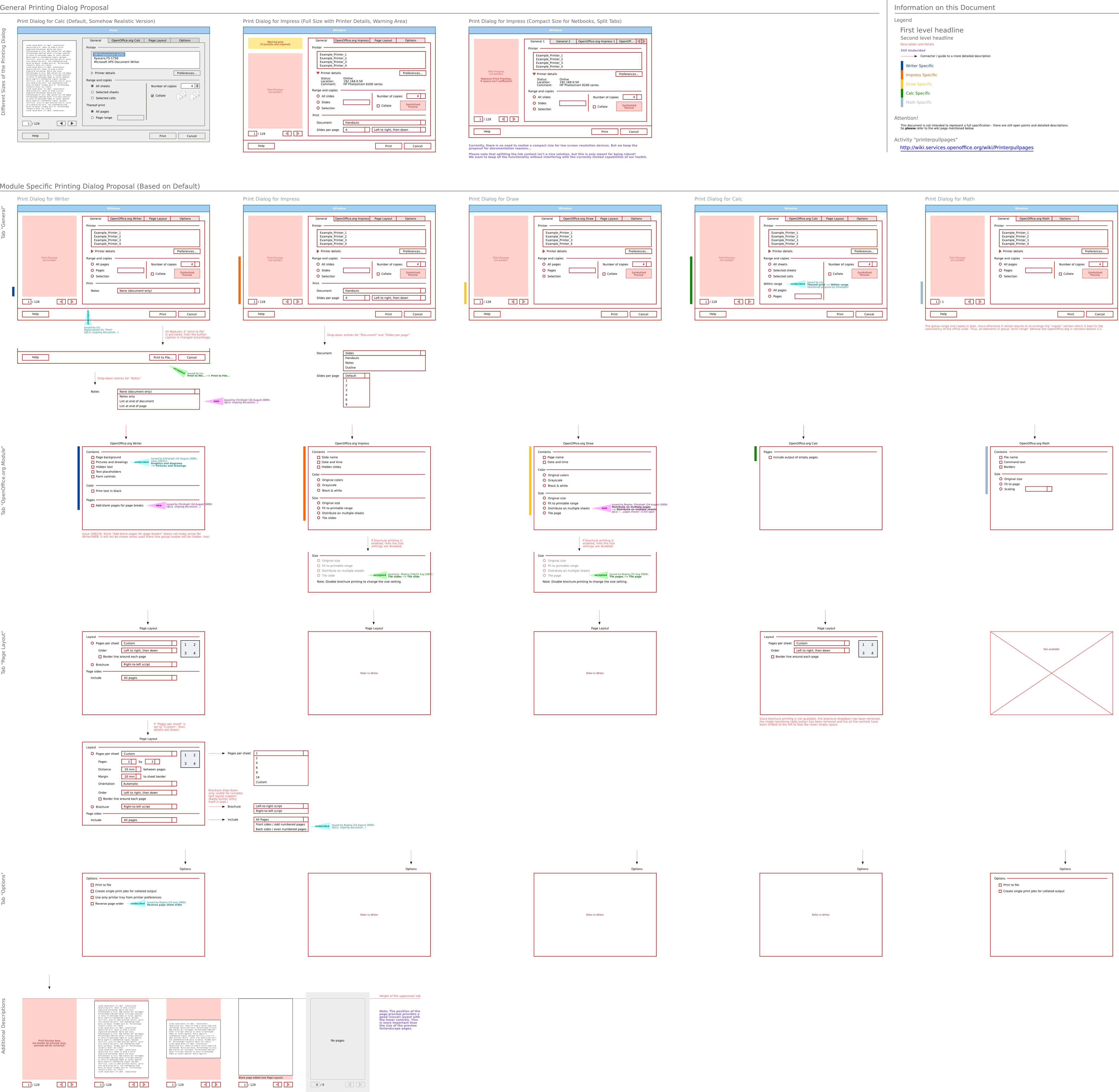
http://wiki.services.openoffice.org/w/images/9/94/2010-01-17_PrintingDialog_inclStringReview.png
Have a look at "Tab Page Layout" for Writer. Although the implementation
differs a lot, the original design tried to keep some kind of "bounding
boxes" around the elements. So each of the elements is aligned with some
kind of bounding box.
For websites - now similar to print design - a column like design can be
introduced. Each of the element groups "snaps" to one of the columns. So
you get a visually stable design (which is usually desired for
content-oriented pages).
Accessibility:
     * Elements sometimes do have limited contrast. For example, the
       text in the header graphic is hard to read (white on bright
       green). The "breadcrumb navigation" is black (small font) on
       gray background.
I'll try to find a better example image. I'll also address the breadcrumb
legibility on the next iteration.
Just a question - how "deep" will the navigation hierarchy be? Do we
really need a breadcrump, or is the site getting that complex?
Okay, time is up :-) I hope this criticism is perceived to be helpful
instead of annoying.
Not at all! Thanks for your time reviewing the design and for the feedback!
:D
Thanks a lot as well! :-)
However, I'm looking forward to see some more
information with regard to the community goals, and thus, the visual
language.
We had a discussion earlier about that. The discussion was if we wanted more
a community site or a product site. I said we needed both. A dedicated
community portal (for example "community.libreoffice.org", not in design
proposal), and the frontpage to be a product oriented page.
Italo provided his marketing thoughts about that on the website list (I
think...). But you know about that, I'm sure :-)

However, is there any documentation about the target groups within the
Drupal wiki pages ... sorry for the question, I ask "you" instead of
searchin on my own.
By the way, maybe I have discussed some things not being meant for
discussion.
Like what?
Something which isn't e.g. not finished. Having a look at the picture,
doesn't tell me what parts of the site should be omitted. See below ...
I recommend to use the "Fidelity Matrix" to improve such
kinds of discussions. I blogged about it here:

http://uxopenofficeorg.blogspot.com/2010/05/picture-is-worth-thousand-words.html
Ok, I'll read that now.
Thanks - to me, this is a very helpful tool. I hope it will be helpful
for you, too.

So now, anybody (e.g. one of the visual designers) to add some more
thoughts?

Bye,
Christoph


--
Unsubscribe instructions: E-mail to design+help@libreoffice.org
List archive: http://www.libreoffice.org/lists/design/
*** All posts to this list are publicly archived for eternity ***
Context
Privacy Policy |
Impressum (Legal Info) |
Copyright information: Unless otherwise specified, all text and images
on this website are licensed under the
Creative Commons Attribution-Share Alike 3.0 License.
This does not include the source code of LibreOffice, which is
licensed under the Mozilla Public License (
MPLv2).
"LibreOffice" and "The Document Foundation" are
registered trademarks of their corresponding registered owners or are
in actual use as trademarks in one or more countries. Their respective
logos and icons are also subject to international copyright laws. Use
thereof is explained in our
trademark policy.