Hi Pawel,

I'm forwarding your question to the website list where we have people
who will be able to help.

Regards,
Ivan.

---------- Forwarded message ----------
From: Paweł K.
Date: 2011/2/5
Subject: Re: [libreoffice-design] Weak icons

PS: How can I create (translate from english) polish version of
LibreOffice site?
http://www.libreoffice.org/international-sites/

W dniu 4 lutego 2011 16:39 użytkownik Paweł K.
<polishnetwork@gmail.com> napisał:
Hi,
I think that file type icons sent to me by you will be great.

Interface graphics (small toolbar icons in fe. Writer) for me is also (for today) bad - this
icons have too much colors and, some of them, too many detail (eg. "Paste", "Font color"). This
icons should be clear to understand and simple in design. Some of them have "cold" colors and
others have more colors (eg. "Increase indent" [mainly white and dark blue] and "Font color"
[blue and brown]) - they are diffrent in colors, I don't like it. For me all of this icons should
be similar in colors and simplicity.
It's my opinion.
Greetings

2011/2/3 Ivan M. <ivanm@patentpending.co.nz>
Hi Pawel,

2011/2/3 Paweł K. <polishnetwork@gmail.com>:
I am writing about file type icons (fe. DOC, DOCX, ODT) and also about icons
in LibreOffice toolbars (fe. button "Save", "Bold"). As I said, I like icons
from OpenOffice 3.2.1.
Thanks for fast reply and sorry for my bad English.
Thanks for clarifying that - Christoph was right (he usually is ;P)
We had lots of negative feedback on the OOo mailing lists about 3.2.1
icons (mainly because they lacked color) - it was quite a significant
issue and it made lots of users angry. One of the first things LibO
did was to revert the icons to the pre-3.2.1 style before new icons
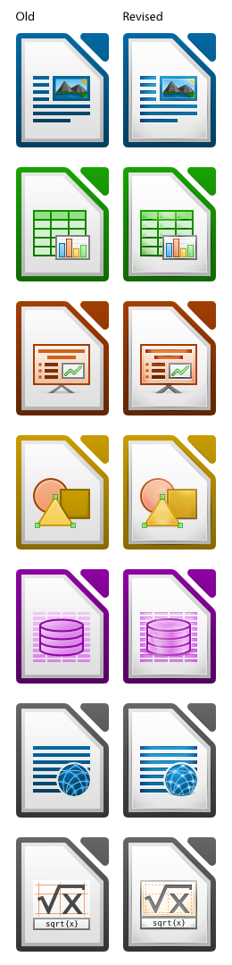
could be implemented. We are now (almost) ready with those new icons,
and you can see them on this image:
http://2.bp.blogspot.com/_9MZR46ZEuS8/TURcR5CLQPI/AAAAAAAAAuA/6gLZ8h2RS9Y/s1600/RevisedIcons128px.png
For me they offer the best of both worlds: an improved design and much
needed color. What do you think?
Regards,
Ivan.
--
Unsubscribe instructions: E-mail to website+help@libreoffice.org
List archive: http://listarchives.libreoffice.org/www/website/
*** All posts to this list are publicly archived for eternity ***
Context
- [libreoffice-website] Creating Polish LibO Site · Ivan M.
Privacy Policy |
Impressum (Legal Info) |
Copyright information: Unless otherwise specified, all text and images
on this website are licensed under the
Creative Commons Attribution-Share Alike 3.0 License.
This does not include the source code of LibreOffice, which is
licensed under the Mozilla Public License (
MPLv2).
"LibreOffice" and "The Document Foundation" are
registered trademarks of their corresponding registered owners or are
in actual use as trademarks in one or more countries. Their respective
logos and icons are also subject to international copyright laws. Use
thereof is explained in our
trademark policy.