Hi Cor,

On Wed, Sep 18, 2013 at 5:16 PM, Cor Nouws <oolst@nouenoff.nl> wrote:
Hi Mirek,

Mirek M. wrote (09-09-13 14:46)


 I share your sentiments about the sidebar. It should definitely be
hidden by default, as it adds minimal value in return for a bunch of
wasted space and a less focused, messier interface. The exception to
this would be Impress, because it already relies on the task pane for
key functionality and the sidebar is the replacement.
OK. And maybe, when visible in the other modules, remove some formatting
toolbar?
I'm not sure if I said it in this post, but I look at the Properties panel
as the replacement for modal dialogs -- like the Inspector in Mac
applications. Thus I imagine it not acting as a replacement to the toolbar,
but as a supplement.
When you're writing, you want your workspace to be clean, uncluttered, so
that you can focus on the task at hand. The toolbar serves you quick
formatting options, but generally stays out of the way (at least when you
remove or streamline and move the Standard toolbar). When you happen to
need an advanced formatting option that you rarely use, that's when you
show the Properties panel. It shouldn't be on full-time (unless you refuse
to use styles and constantly have breaks for using advanced formatting
options while creating content; that's not a use case we should encourage,
though).
Since the user won't be using the panel full-time and since the Show/Hide
button for the panel should be part of the contextual toolbar itself, it
would be good to keep the toolbar visible even when the Properties panel is
shown to not disorient the user.
My vision for the sidebar is a bit different, though.
First and foremost, I'm hoping that the sidebar will be made modular,
allowing the user to undock each individual panel (represented by a tab)
from the sidebar. Keep just a single panel docked, the tab bar would
disappear. That would mean that we'd get rid of the awful panel
duplication we have with the Sidebar now -- there would a single
Navigator, a single Gallery, and a single Style pane, and all of these
could be docked/undocked at any side of the window and grouped into tabs
as one wished. This is all standard panel behavior, btw -- if you want
to try it, just take a look at Gimp or Inkscape. (And I believe the
Adobe counterparts work similarly.)
Those ideas for panel behaviour look sound to me. But less important in my
view then the items I brought forward .. ;)
They're very important to me -- I can't stand the odd duplication we have
going on, with two Navigators, two Galleries, and two Style panes.
If you're using the Sidebar, you have to launch a separate Navigator in
case you need to use two panels at once.
And that might be hard to discover how to do, since it's not clear what
View -> Navigator or the Navigator icon in the toolbar will do.
As for the Properties panel, I'm hoping it will gain Style dropdowns
like those in the toolbar (Kendy's working on this). I see no reason to
fill the Properties panel with styles, though, as we already have the
Styles panel for that.
It would be my strong, very strong, preference to make controls for direct
formatting hidden, far hidden, and clearly show styles in a useful way.
Despite favoring styles, I wouldn't dismiss the usefulness of
hard-formatted bold/italic/underlines -- they're much simpler to apply than
styles and they're as easy to replace (using Find and Replace).
I would love for the font picker and font size picker to be deemphasized,
though, given that these two should almost exclusively be applied through
paragraph styles.
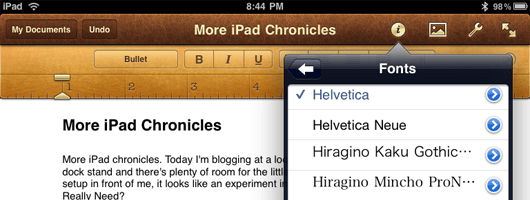
GMail had fonts under an icon-only drop-down before its redesign. [1] Many
mobile word processors do the same [2][3] (although Drive [4] has the text
label "Fonts" instead of an icon).
I would love for the font picker to use an icon-only drop-down as well.
That would not only deemphasize the font picker, it would also emphasize
the style picker, which would now be the widest element in the toolbar.
Furthermore, it's the Properties panel, so I would expect it to hold any
and all of the object properties. That's the role dialogs play right
now, and I'm hoping that, over time, the Properties panel will gain all
of their functionality and replace them one by one. The advantage to
that would be fast and easy access to this functionality, and the
ability to see the changes happen live in the document.
I like the idea of seeing a life preview. On the other hand, applying a
style and hitting Ctrl-z or the undo button, or the other style when it's
not what is wanted, isn't a big deal too.
Of course. That's what the Styles panel is for. (That said, that panel
should really use single-click for applying styles -- double-click is
unnecessarily strenuous.)
The concept is
basically the same as that of the Inspector window, which has long been
used on Mac OS and is a key part of iWork.
Cheers,
Cor

PS See you in Milan?
Yes, I hope so. :)
--
 - Cor Nouws
 - http://nl.libreoffice.org
 - The Document Foundation Membership Committee Member
[1]
http://www.gmailloginhelp.com/wp-content/uploads/2013/03/Formatting-Fonts-and-Colors-in-Gmail.jpg
[2] http://www.thebookdesigner.com/wp-content/uploads/2010/06/pages.png
[3]
http://www.ipad-apps-reviews.com/gallery/quickoffice-ipad/quickoffice_ipad_3.jpg
[4]
https://lh3.ggpht.com/ADurfKs067aB9hxldYqvAjXmWCbrys281UdFvJygTQisVoRIfcrJ8HOw-XLtna5YJ_M=h310
Context
- Re: [Libreoffice-ux-advise] LO's styles are more confusing then MSO's (Was Re: some thoughts on the Sidebar) (continued)
Privacy Policy |
Impressum (Legal Info) |
Copyright information: Unless otherwise specified, all text and images
on this website are licensed under the
Creative Commons Attribution-Share Alike 3.0 License.
This does not include the source code of LibreOffice, which is
licensed under the Mozilla Public License (
MPLv2).
"LibreOffice" and "The Document Foundation" are
registered trademarks of their corresponding registered owners or are
in actual use as trademarks in one or more countries. Their respective
logos and icons are also subject to international copyright laws. Use
thereof is explained in our
trademark policy.