Hi Samuel,

On Wed, 2012-11-21 at 18:10 +0100, Samuel Mehrbrodt wrote:
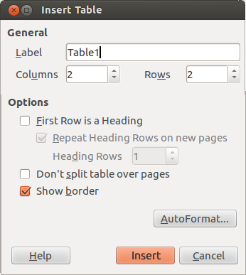
Hi all,

I have modified the layout and wording of the "Insert Table" Dialog in
Writer a bit, see attached screenshot.
Thanks, looks much nicer than before.
Any suggestions for improvement? I am not sure if the spacing between
widgets is correct.
(See attached mockup. Explanations below. Please note that this is a 5
minute mockup and some things might not align exactly as they should.)

Yes, you're right, some things look slightly crammed... the Gestalt
principles say that you should visually group things that belong
together, so...

* the General and the Options group seem a bit close – not sure if
  that's a general issue with all the new dialogues, but ~5–10 pixels
  more distance wouldn't hurt

* It would be good if you could also enforce more space between the
  Columns text box and the caption "Rows:"

* Also, the hierarchy First Row is a Heading > Repeat Heading[...] >
  Heading Rows[...] was not quite as clear any more, so I reinforced it

Next, I made some changes to the buttons:

* On new dialogues, we usually put the Help button to the far left

* On new dialogues, we usually try to label buttons with something more
speaking than OK, in this case, Insert seems a good fit

* Our old dialogues unconditionally use Windows's unholy Primary
  Button/Secondary Button ordering – if the button order is still
  unconditional, we should probably keep with the Windows standard to be
  consistent; thus, I have reordered Insert and Cancel

* I gave the AutoFormat... button some more space and put it on the
  right – looks better to me

* I am not so sure if we want to keep that obnoxious AutoSomething
  terminology forever, if you have better ideas and we don't use
  AutoFormat often in conjunction with tables, do go ahead and change
  it :)


Regards,

Astron.
Attachment:
insert-table-dialog-2.png
Description: PNG image