Hi Alex,

On Mon, Oct 8, 2012 at 9:24 AM, Alexander Thurgood
<alex.thurgood@gmail.com>wrote:
Hi all,

So, I've just got around to looking at this on Mac OSX (sorry about
that, but getting a debug build takes forever) and have a few questions
/ remarks :

(1) why is there no "Back" button or arrow ?

What I mean by this is that when a user clicks on a category of
templates, at least on OSX, he/she has no way of navigating back to the
upper hierarchy via a simple back button, indeed as is standard in the
OSX HMI which uses the Finder dialogs for this sort of thing. Even the
old template manager dialog had one.
AFAIK, the new OS X file management uses no back button as well. [1]
Instead, clicking a folder "expands" it and clicking away folds it back.
The folders in the template dialog should work somewhat similarly --
clicking away or clicking "X" should dismiss a folder overlay and return
back to the upper hierarchy.
(2) one can not use the scroll arrows to scroll down the list of
template entries in any given category - trying to do so just results in
the upper main category buttons being commuted selectively from left to
right or right to left depending on which scroll arrow key is pressed.
The user has to use the mouse or touchpad to scroll down.
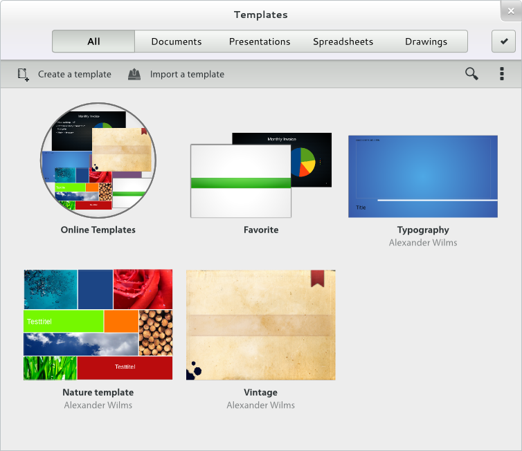
(3) for some reason, the collection of templates in any given
sub-category is displayed as two overlaid transparent examples of the
templates in that category, perhaps the first and the last, I don't
know, but the fact that they are overlaid each other in a transparency
mode doesn't make it at all obvious what exactly is being represented
and does not look particularly good (but maybe that's just a matter of
personal taste, like so many GUI things) - is it supposed to be like this ?
I would say that's partly my fault for not devoting time to designing a
folder. (The original design was a non-transparent stack [2], but I agree
we could do much better.)
Rafael, would you be willing to implement a different look for a folder if
we designed it?
I also managed to get OSX to crash when attempting to use the scroll
arrow keys, but will have to see if this a one-off, or reproducible.


In terms of OSX HMI design this will not do anything to increase LO's
popularity on that platform, in fact I believe you will be more likely
to drive people away with stuff like this. What, if any, further feature
development is planned ? I realise that a lot of work went into this and
am grateful for that, but when re-thinking UI design, please spare a
thought for all of the OSes for which LO is built and provided.

Alex
P.S. Could you post a screenshot?

[1]
http://cdn-static.cnet.co.uk/i/c/rv/e/software/apple/mountain-lion/mountain-lion-icloud-document-library.jpg
[2] http://wiki.documentfoundation.org/images/e/e8/Templs.png
Context
Privacy Policy |
Impressum (Legal Info) |
Copyright information: Unless otherwise specified, all text and images
on this website are licensed under the
Creative Commons Attribution-Share Alike 3.0 License.
This does not include the source code of LibreOffice, which is
licensed under the Mozilla Public License (
MPLv2).
"LibreOffice" and "The Document Foundation" are
registered trademarks of their corresponding registered owners or are
in actual use as trademarks in one or more countries. Their respective
logos and icons are also subject to international copyright laws. Use
thereof is explained in our
trademark policy.