On Sat, 2012-05-26 at 17:24 +0200, Alexander Wilms wrote:
Sounds good.
:-)
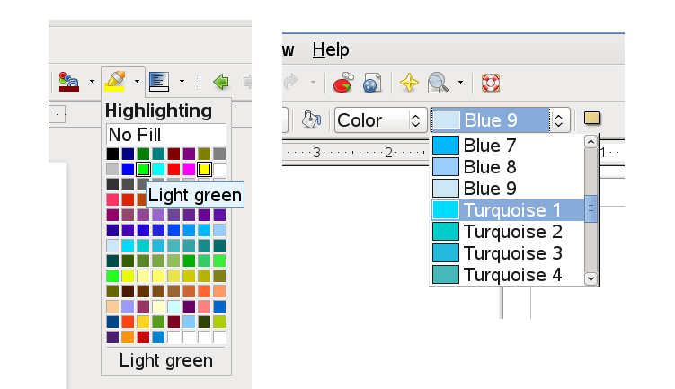
Maybe it would be even better to move all the grey colors up so that
that they aren't somewhere between the other colors.
        Not sure :-) many lazy people just pick from the immediately accesible
colors in the drop-down without scrolling.

        Of course, the widget itself is just busted - who cares about the
'name' of a color ? why waste all that space by presenting it ? I
suspect a drop-down palette like we have in writer would be much more
useful. Any thoughts there ?

        Why do we have that silly, hard-to-use color list in the app where
people most select colors, and a nicer palette widget in writer ?
[ presumably changing that is (modulo dynamically tweaking the combo box
to popup a different widget) an easy-hack ;-]

        Thanks,

                Michael.

--
michael.meeks@suse.com  <><, Pseudo Engineer, itinerant idiot
Attachment:
uh.png
Description: PNG image