Hey,
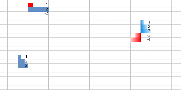
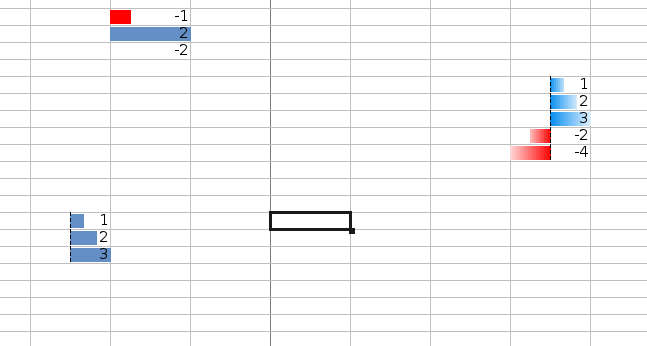
the data bar code is now in a quite good shape so that I can focus on
the smaller things. There is one thing were I have no idea which one
is better. You'll find attached two versions of the same file. In the
small version the data bar does not fill the whole cell while it does
in the large version. Excel uses something similar to the small
version.
Which version do you prefer and which one is the clearest from an UX
point of view?
Regards,
Markus
Attachment:
databar_large.png
Description: PNG image
Attachment:
databar_small.png
Description: PNG image
Context
- [Libreoffice-ux-advise] layout of data bars · Markus Mohrhard
Privacy Policy |
Impressum (Legal Info) |
Copyright information: Unless otherwise specified, all text and images
on this website are licensed under the
Creative Commons Attribution-Share Alike 3.0 License.
This does not include the source code of LibreOffice, which is
licensed under the Mozilla Public License (
MPLv2).
"LibreOffice" and "The Document Foundation" are
registered trademarks of their corresponding registered owners or are
in actual use as trademarks in one or more countries. Their respective
logos and icons are also subject to international copyright laws. Use
thereof is explained in our
trademark policy.