Hi Astron,

On Thu, 2011-11-10 at 13:26 +0100, Astron wrote:
       Tim also removed the pointless old/new handles code, so there is now
only one image to touch of each: markers.png and cropmarkers.png -
hopefully that is easier to grok.
Great. Can we also remove the "small" handles along the way? They are now looking much too small with the new handles. In the new version attached, I already removed the transparent borders, so they look practically the same size as the large ones, but now will look slightly weird in situations where a 7*7 and a 9*9 handle are layered on each other (for instance in Impress: add a new text field, select it → see top left corner) .
        Interesting. Would it be better simply to add the capability to have
even larger handles. I'd like to do that by re-doing the markers code -
to add an extra size, we have 13x13 I suppose at the bottom right (do we
use them currently ?).
I think that is not correct. I measured the anchor (in Gimp) from my
screenshot and it seemed squished in both directions (ie 23*22).
Hey ho :-) Tim is still chasing it, while doing other things.
I wrote a message to Regina to see if she knows more, she said she
never saw these before, so I won't theme them for now.
Makes perfect sense.
Lastly: attached is a patch (everything still builds and looks fine,
yay) that does the following things:
Wow - this is lovely, an unexpected prize :-) nice work there.
* modify svdhdl.cxx to accept sprites where none of the elements share
borders and the anchor is a 24*24 square
Looks good.
* modify sprites (for hicontrast, default_images and industrial (ie
my sprite))
Nice work, also nice.
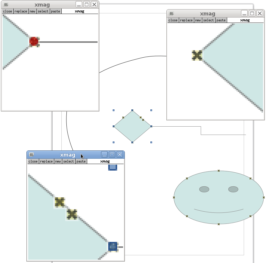
* add a "Glue_Deselected" handle type to svdhdl.cxx (and its header),
in case someone wants to replace the little blue cross, but it's not
wired up currently, it just knows the right image position to use – I
hope I did that in an okay way [1]
        It's fine - I joined the dots there and ripped out the old code. The
good news is that connection points (when not selected) are now
incredibly more visible :-) the smiley in the screenshot reminds me of
my teenage years ;-) [ which is I think good ]. The difference between
selected and un-selected is perhaps not as large as it could be ?, see
the xmag output there ]. there also seem to be some minor gluepoint /
vertex alignment issues, but whether that is in the underlying
draw-shapes, or not it's hard to say: they look pretty awful in the
previous 3.4 code, that's for sure :-)
* change the Industrial icons for the Points toolbar to incorporate
blue handles (they used to be red)
Lovely.
Thanks a lot to you, Tim and Michael, for pushing the modern/classic
handles change so quickly.
        Not at all :-) I pushed your changes anyhow.

On Fri, 2011-11-11 at 10:41 +0100, Astron wrote:
Patch under MPL/LGPL3+, of course. Always forget to say that.
        So - if you can send a blanket mail to the developers mailing list
saying: "all my contributions to LibreOffice are & will be under
MPL/LGPLv3+" or somesuch - then we can link it here:

        http://wiki.documentfoundation.org/Development/Developers

        Then if you go through this rigmarole:

        http://www.freedesktop.org/wiki/AccountRequests

        and send me the bug number, I'll get you setup with a commit account so
you can push artwork tweaks directly to master to your heart's
content :-)

        Thanks again for the great work !

        All the best,

                Michael.

--
michael.meeks@suse.com  <><, Pseudo Engineer, itinerant idiot
Attachment:
connectors.png
Description: PNG image