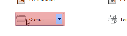
Hi Joel,


I think you've made the area behind the separator a bit large now –
having it slightly larger than in 3.5 definitely is a good idea, though.

But: I don't think the width of the area is the only or even the most
important problem – the problem seems to be the clickable area. I've
attached a screenshot of the approximate clickable areas of the button:
the red area are brings up the regular file chooser, the blue area
brings up the list of last opened files.
As you can see, the blue area actually covers only a small part of the
right side of the button which is quite easy to miss. Can you look into
that (if you haven't already – I didn't try your patch)?

Astron.
Attachment:
clickableareasopenbutton.png
Description: PNG image