Hi Everyone.
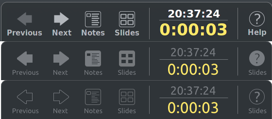
As part of a bit of polishing of the UI of the PresenterConsole
extension I wish to undertake, I want to improve the icons used at the
bottom.
Could you give me your opinion, as to which is best?
1st - As it currently is
2nd - Smaller font, no use of bold, 'filled' icons
3rd - Smaller font, no use of bold, 'line drawing' icons
--
Andrew
Attachment:
presenter-console.png
Description: PNG image
Context
Privacy Policy |
Impressum (Legal Info) |
Copyright information: Unless otherwise specified, all text and images
on this website are licensed under the
Creative Commons Attribution-Share Alike 3.0 License.
This does not include the source code of LibreOffice, which is
licensed under the Mozilla Public License (
MPLv2).
"LibreOffice" and "The Document Foundation" are
registered trademarks of their corresponding registered owners or are
in actual use as trademarks in one or more countries. Their respective
logos and icons are also subject to international copyright laws. Use
thereof is explained in our
trademark policy.