Why I get impression that this Start Center is one step ahead and two steps
back?
True
In my opinion:
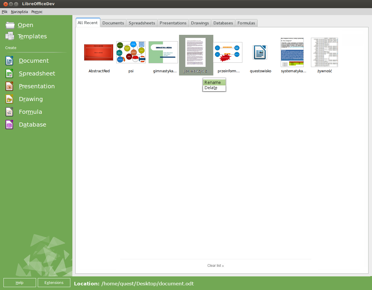
+ there should be "Open" and "Templates" icons. Without them, options are
invisible ("dead zone" for eyes)
+ there should be "Location" address bar.
+ every thumbnail should has gray background only if mouse cursor is over
document
+ user should can manage single document and whole list as well.
+ tabs are really nice feature if user works with many documents
And last but not least. I remove "new" prefix because other language than
English are not so simple and this short word will looks obscure e.g. in
Polish.
https://wiki.documentfoundation.org/images/e/e4/4.2_start_center.png
In my opinon (after this picture)
Tabs are redundant, they share their manes with the labels on the side bar
why not
1 click on the name to get the filtered list
1 click on the icon to get a new … whatever
or
1 click on the side bar item to get the filtered list
1 next click to get a new doc of the selected item, assuming you don't move the mouse because there
is nothing to be found.
If It can help …
Michel
--
To unsubscribe e-mail to: design+unsubscribe@global.libreoffice.org
Problems? http://www.libreoffice.org/get-help/mailing-lists/how-to-unsubscribe/
Posting guidelines + more: http://wiki.documentfoundation.org/Netiquette
List archive: http://listarchives.libreoffice.org/global/design/
All messages sent to this list will be publicly archived and cannot be deleted