Hi Christoph, Bernard, all,
I know the time constraint plays an important role in this, and for what
its worth,
I think you've come up with a really professional icon Design in a short
amount of time.
I'm just sorry my contributions lately have been all talk and no
graphics. Talk is cheap.
On 1/10/2011 10:23 AM, Christoph Noack wrote:
Here is the original version:
http://picasaweb.google.com/noack.christoph/LibreOffice#5558854821889918786

Here is the refined version:
http://picasaweb.google.com/noack.christoph/LibreOffice#5560329076596107730

Opinion(s)?
I think the lighter interior is an improvement and I _would_ recommend
switching the icons so that the current template icons serve as document
icons.
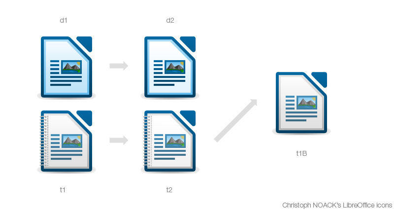
It is hard to explain in just words, so please refer to this image I
hacked together to help explain;
http://tdf.nikashsingh.com/misc/christophicon.jpg
The original template icon (t1) still seems best to me because it looks
like a Paper stack, backed against a blue folder lining.
Of the new lighter versions, while they are an improvement, t2 has no
light-grey gradient on the white inner surface and d2 uses a light-blue
inner border.
My eyes interpret this as;
- t2 loses the consistent look because it doesn't share the "universal
top-lighting" that shades its border and page contents (the
mock-paragraph-lines)
- d2 loses the impression of a pile of stacked pages because the inner
border is blue rather than grey. Reducing the effect of depth.
I think t1 is perfect the way it was originally. Just drop the binder
and reinstate the grey left-inner-border (t1B) and it's a perfect
document icon.
I understand that time has run out. This is not a change-request, just
feedback.
But that is just my opinion. I pay too much attention to these details =)
I LOVE the template (binder) icon. Great stuff Christoph!
Oh, thanks a lot ... but really, I'm just jumping in because we miss a
"pro" here :-)
In my opinion, anyone capable of creating this; ...
http://picasaweb.google.com/noack.christoph/LibreOffice#5558854821889918786
... is someone I'd readily consider a "Pro".
And Bernhard, I think your proposal to complete the icons in their
current form is most reasonable.
There will be a chance to address these small issues down the track,
like you mentioned, and I think Lib/O deserves non-OOo icons! =)
+1 to your "icon finalisation agenda"

-Nik

--
Unsubscribe instructions: E-mail to design+help@libreoffice.org
List archive: http://listarchives.libreoffice.org/www/design/
*** All posts to this list are publicly archived for eternity ***
Context
Re: [libreoffice-design] MimeType icons - template · Nik
Re: [libreoffice-design] MimeType icons - template · Christoph Noack
Re: [libreoffice-design] MimeType icons - template · Nik
Re: [libreoffice-design] MimeType icons - template · Christoph Noack
Re: [libreoffice-design] MimeType icons - template · Christoph Noack
Re: [libreoffice-design] MimeType icons - template · Jaron Kuppers
Re: [libreoffice-design] MimeType icons - template · Bernhard Dippold
Re: [libreoffice-design] MimeType icons - template · Christoph Noack
Re: [libreoffice-design] MimeType icons - template · Bernhard Dippold
Re: Re: [libreoffice-design] MimeType icons - template · Björn Balazs
Re: [libreoffice-design] MimeType icons - template · Ivan M.
Privacy Policy |
Impressum (Legal Info) |
Copyright information: Unless otherwise specified, all text and images
on this website are licensed under the
Creative Commons Attribution-Share Alike 3.0 License.
This does not include the source code of LibreOffice, which is
licensed under the Mozilla Public License (
MPLv2).
"LibreOffice" and "The Document Foundation" are
registered trademarks of their corresponding registered owners or are
in actual use as trademarks in one or more countries. Their respective
logos and icons are also subject to international copyright laws. Use
thereof is explained in our
trademark policy.